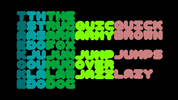

A very short film about the linguistic idiosynchracies of predictive text messaging starring a cheeky overweight semi monospaced typeface called 'Ham'. The typeface is based on letterforms initially designed for the film 7090. Submitted to the 4th annual Typophile Film Festival.
* A CONFESSION. Since making this film I visited the Hacienda 25 Exhibition: fac491 at Manchester's Urbis and noticed a striking similarity between the letter forms of this typeface and the graphics for a club night called Flesh from the mid early 1990s. Some of the colour ways used through out the film are also very similar. These similarities were unintentional, although I do remember the club night and its graphics, so it is highly likely that they had a subconscious effect on me. I apologise to the promoters of Flesh and the designers responsible for their graphics. I intend to re-edit the film to amend some of the more obvious similarities.
Screenings:
4th Typophile Film Fest, San Fransisco (Oct 2007)
4th Typophile Film Festival, TypeCon2007, Seatle (Aug 2007)